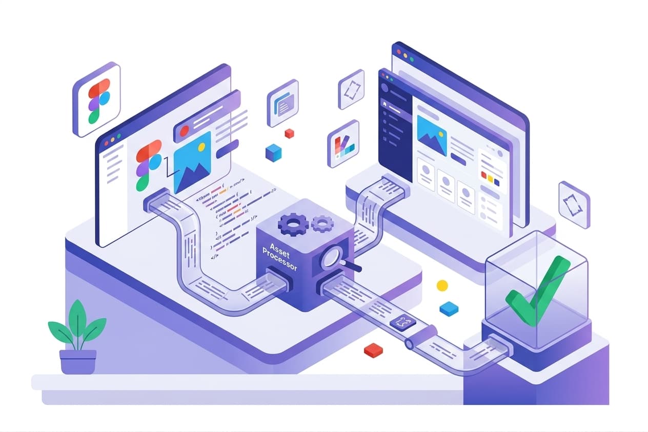

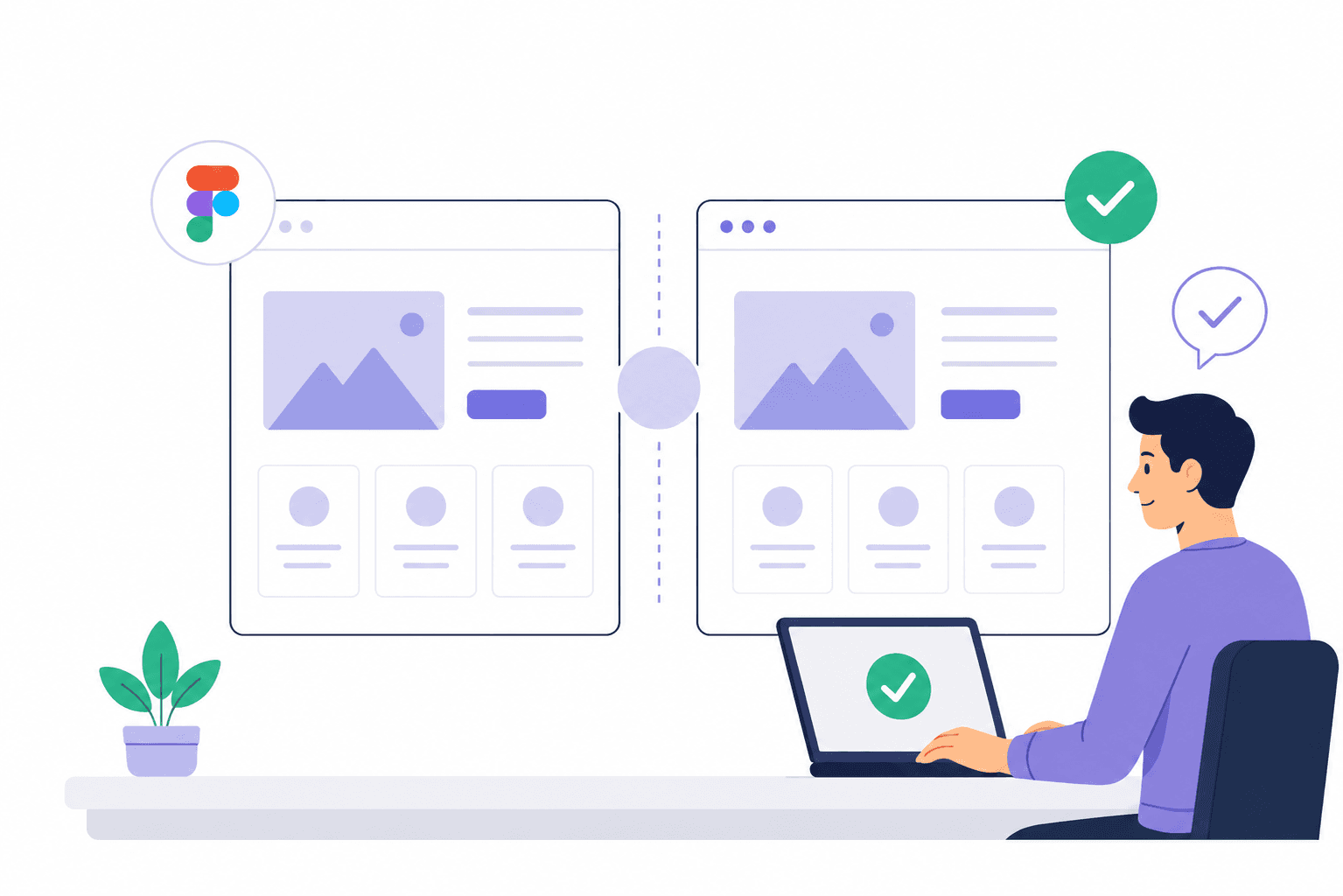
For web agencies, revisions are part of the job. But there is a big difference between legitimate client feedback and revisions caused by a website not matching the approved Figma design.
A developer updated one component but missed another page. The client notices it during review, sends feedback, and the team goes back into development. Then comes another review. Then another revision.
The problem isn't always the client.
Often, the problem is that the agency didn't have a reliable Figma-to-website QA process before sending the project for approval. Modern agencies use whoogy these days.
What Causes Figma Revision Cycles?
Most Figma revision cycles come from one of four problems:
The implementation doesn't match the approved design.
The design changes after development begins.
Different team members interpret the design differently.
The website isn't visually tested before client review.
The fourth problem is particularly expensive.
Developers usually test whether a website works. Agencies also need to test whether it matches the design. Those are two different QA questions.
A website can have working navigation, valid forms, responsive CSS and no console errors while still looking noticeably different from the approved Figma file.
That difference becomes a client revision. Catch before it turns into headache.
The Missing Layer in Website QA: Figma-to-Website Comparison
Traditional website QA usually focuses on functionality:
Do the buttons work?
Do forms submit?
Are links working?
Does the navigation open?
Does the website work on mobile?
Are there JavaScript errors?
Those checks are important.
But they don't answer another critical question:
Does the finished website actually match the approved Figma design?
That's where visual QA comes in.
A Figma-to-website QA process compares the design with the rendered implementation and looks for differences in:
Layout
Spacing
Typography
Colors
Components
Images
Alignment
Dimensions
Responsive behavior
Whoogy is designed specifically around this workflow, allowing agencies to compare a Figma design with a website and surface visual mismatches before they become client feedback and gives report in 3 mins.
1. Establish One Approved Figma Source of Truth
Before development begins, establish exactly which Figma design is approved.
This sounds obvious, but agencies often have:
Multiple Figma pages
Old design versions
Unapproved explorations
Different desktop designs
Mobile designs in separate frames
Components that changed after development started
Client comments that haven't been incorporated
Your development team should know:
Which Figma frame is the source of truth?
Document:
Figma file
Figma page
Approved frame
Breakpoint
Version/date
Approved components
Outstanding design changes
This prevents a common problem:
The developer builds from one version while the client reviews against another.
How Whoogy helps
Once the approved Figma design is the reference point, Whoogy can compare it against the actual website rather than relying on someone manually switching between tabs and eyeballing the differences. Try Today 👉 www.whoogy.com
That makes the approved design an actual QA reference instead of simply a handoff document.
2. Define What "Pixel Perfect" Actually Means
"Make it pixel perfect" isn't a QA process.
Your team needs to define what it actually means.
At minimum, compare:
Layout
Container width
Section spacing
Margins
Padding
Grid alignment
Element positioning
Typography
Font family
Font size
Font weight
Line height
Letter spacing
Heading dimensions
Colors
Background colors
Text colors
Border colors
Button colors
Gradients
UI states
Components
Buttons
Cards
Navigation
Forms
Icons
Images
Repeated UI components
Responsive behavior
Compare the implementation against the relevant:
Desktop design
Tablet design
Mobile design
A page that looks correct at 1440px can still be significantly different at 390px.
This is why responsive Figma-to-website testing should be part of the QA process, not something checked five minutes before launch.
3. Don't Rely Only on Human Eyeballing
Manual visual review is useful.
But it doesn't scale particularly well.
Imagine an agency has a 20-page website.
A designer or developer has to:
Open Figma.
Find the correct frame.
Open the website.
Resize the browser.
Switch between the two.
Compare spacing.
Compare typography.
Compare colors.
Check components.
Repeat the process on mobile.
Move to the next page.
Repeat everything again.
Now imagine doing that for five client websites every month.
The problem isn't that your team can't do it.
The problem is that you're using valuable people to perform repetitive visual comparison manually.
Humans should make the decisions.
Automation should help find the differences.
That's where a tool like Whoogy becomes useful.
Instead of asking:
"Does anything look wrong?"
your team can ask:
"Which parts of this website don't match the approved design?"
That's a much better QA workflow.
4. Compare Figma Against the Actual Website
The most important step is simple:
Compare the approved Figma design with the rendered website.
Not the source code.
Not the developer's intention.
Not the component library.
Not a screenshot from last week's build.
The actual rendered website.
This can reveal issues such as:
Incorrect spacing
Wrong font sizes
Incorrect font weights
Misaligned components
Incorrect colors
Missing elements
Different image sizes
Incorrect border radius
Layout shifts
Responsive differences
For example:
Figma
Button height: 52px
Website
Button height: 44px
The button works perfectly.
But it doesn't match the approved design.
That's a visual QA issue, not a functional QA issue.
And it is exactly the kind of issue that can turn into a client revision.
5. Use Whoogy Before Client Review
This is where the workflow becomes much simpler.
Instead of:
Build → Client → Client finds issues → Revision
Use:
Build → Whoogy comparison → Fix → Final QA → Client
Whoogy compares the Figma design with the website and produces a visual QA report so your team can focus on the differences that actually need attention.
The goal isn't to replace your designer or developer.
The goal is to remove the repetitive part of visual QA.
Your team still makes the decisions.
Whoogy helps them find what needs to be reviewed.
6. Create a Pre-Client QA Gate
Don't make client approval the first serious visual test.
Create a hard QA gate before the approval link is sent.
Recommended agency workflow
Development
↓
Figma-to-website comparison
↓
Review Whoogy report
↓
Fix visual differences
↓
Final QA
↓
Client approval
This changes the feedback loop completely.
Without a visual QA gate
Development → Client → Revision → Developer → Client → Revision
With a visual QA gate
Development → Visual QA → Fix → Client approval
The client can still request legitimate changes.
But your team isn't asking the client to discover obvious implementation mistakes.
7. Separate Client Changes From QA Errors
Not every client revision is a problem.
There are two completely different types of feedback.
Category A: New Requirement
The client says:
"Can we make this section blue instead?"
The approved Figma design was green.
That's a legitimate change request.
It may require additional development. or use whoogy Document override testing to overcome directly in production.
Category B: Missed Implementation
The approved Figma design was already blue.
The website is green.
That's not a new requirement.
That's a QA issue.
Your agency should track these separately.
Otherwise, teams start saying:
"The client keeps asking for revisions."
When the reality is:
"We keep sending builds that don't fully match the approved design."
That distinction matters.
8. Catch Design Drift Across Pages
One of the most frustrating agency problems is inconsistent components.
The first page looks correct.
The second page looks correct.
Then you discover the button on page 7 has:
Different padding
Different font weight
Different border radius
Different color
Different hover state
The developer fixed one component but another implementation was left behind.
This is design drift.
Whoogy's visual comparison workflow is useful here because agencies can check pages against the approved design instead of relying entirely on memory or manual review.
The larger the website, the more important consistency becomes.
9. QA Mobile Before the Client Does
Desktop QA isn't enough.
Many Figma revision cycles begin with mobile.
The desktop version looks good.
Then the client opens the site on their phone.
Suddenly:
The heading wraps differently.
The button is too wide.
The spacing is wrong.
A card doesn't stack correctly.
An image is cropped incorrectly.
The navigation looks different.
A section is too tall.
The mobile Figma design should be treated as a QA reference.
A strong agency workflow should compare:
Desktop Figma → Desktop website
and
Mobile Figma → Mobile website
This is especially valuable for agencies delivering responsive websites where visual fidelity matters.
10. Turn QA Into a Report, Not an Opinion
"Looks good to me" isn't a QA report.
A useful visual QA process should tell your team:
What is different?
Where is it different?
How severe is it?
What should it look like?
What does it currently look like?
What needs to be fixed?
This is one of the biggest advantages of having a structured Figma-to-website QA workflow.
Instead of sending a developer a vague message:
"The homepage feels a little off."
You can give them a specific visual issue.
That makes fixes faster.
It also creates a clear record of what was reviewed before client approval.
Free Figma-to-Website QA Checklist
Before you send your next website to a client, check:
Design
Approved Figma version confirmed
Correct Figma frames selected
Layout matches
Spacing matches
Typography matches
Colors match
Buttons match
Cards match
Images match
Icons match
Responsive
Desktop checked
Tablet checked where applicable
Mobile checked
Navigation checked
Responsive spacing checked
Images checked
Typography checked
No horizontal overflow
Functional
Navigation works
Buttons work
Forms work
Links work
CTAs work
Interactive states work
Final client review
Visual comparison completed
Major differences fixed
Final QA completed
Approval link tested
Client-ready build confirmed
Want to stop doing these comparisons manually?
Run your next Figma-to-website QA with Whoogy.
Compare your approved Figma design against the live website, find visual differences, and get a QA report before your client finds them.
How Whoogy Fits Into an Agency Workflow
Whoogy doesn't need to replace your existing development or QA stack.
Think of it as the visual QA layer between development and client approval.
Your existing workflow
Figma
→ Development
→ Functional QA
→ Client
With Whoogy
Figma
→ Development
→ Functional QA
→ Whoogy visual QA
→ Fix
→ Client
That extra step can prevent an entire revision loop.
And that's the real value.
You're not buying another tool just to find pixels.
You're reducing the number of times your team has to go back into development because the client found something that should have been caught internally.
When Should an Agency Use Figma-to-Website QA?
A Figma comparison is particularly useful when:
You're building websites from Figma.
Projects are fixed-price.
Client revisions are eating into margins.
Multiple developers work on the same website.
Your agency builds several websites each month.
Mobile accuracy matters.
Designers and developers work separately.
You want a repeatable QA process.
You need evidence before client approval.
For small projects, manual review may be enough.
For agencies managing multiple projects, repeatable visual QA becomes increasingly valuable.
The New Agency QA Workflow
The goal isn't to eliminate client feedback.
That's unrealistic.
The goal is to eliminate avoidable client feedback.
A modern Figma-to-website workflow looks like:
1. Design
Create and approve the Figma design.
2. Handoff
Give development a clear source of truth.
3. Build
Turn the approved design into the website.
4. Compare
Compare the rendered website against Figma.
5. Find
Identify spacing, typography, color, layout, component and responsive differences.
6. Fix
Resolve the issues before the client sees the website.
7. Verify
Run the final QA.
8. Approve
Send the clean build to the client.
9. Launch
Move forward without another avoidable revision cycle.
Final Notes
Reducing Figma revision cycles isn't about asking clients to give less feedback.
It's about making sure your team catches implementation mistakes before the client does.
A reliable agency process should connect:
Figma → Development → Visual QA → Fixes → Client Approval
And Whoogy fits directly into that gap.
Instead of manually comparing every screen, your team can use Whoogy to compare the Figma design against the actual website, identify visual differences, and generate a QA report before the client reviews the build.
Fewer surprises. Fewer revision loops. Faster approvals. Better project margins.
Ready to catch the differences before your client does?
Run your next Figma-to-website QA with Whoogy.
Compare your design and website in minutes, identify the visual issues that matter, and send the client a build your team has already checked.
Frequently Asked Questions
How can web agencies reduce Figma revision cycles?
The most effective approach is to compare the approved Figma design against the actual website before client review. Agencies should check layout, spacing, typography, colors, components, and responsive behavior. Tools like Whoogy can automate much of this visual comparison.
What is Figma-to-website QA?
Figma-to-website QA is the process of comparing an approved Figma design with the rendered website to identify visual differences before launch or client approval.
Why does a website look different from Figma?
Differences can come from incorrect CSS values, fonts, spacing, responsive rules, component implementations, image dimensions, colors, or developers implementing an older version of the design.
Can Whoogy compare Figma with a live website?
Yes. Whoogy is designed to compare Figma designs against website implementations and identify visual differences such as spacing, typography, colors, and layout mismatches.
How does visual QA reduce client revisions?
Visual QA catches implementation differences before the client sees them. This allows the agency to fix issues internally instead of turning them into another client feedback and development cycle.
Is visual QA different from functional QA?
Yes. Functional QA checks whether a website works correctly. Visual QA checks whether the website looks and behaves visually as intended by the approved design. Both are important for agency website delivery.