
The client shouldn't be the first person to find the bugs.
Sending a website to a client for approval should mean: "We've checked this."
It shouldn't mean: "Let's see what the client finds."
Yet that's how website QA often happens inside busy web agencies. A developer checks the homepage. A project manager clicks a few links. Someone opens the website on mobile. Then the approval link gets sent.
The client finds three spacing issues, a broken button, a mobile problem, and a section that doesn't match the approved Figma design. Now the project is back in development. Another revision cycle starts. And another.
For agencies, these aren't just small UI problems. They're extra developer hours, delayed approvals, and margin lost to avoidable rework.
A proper website QA process should catch these issues before the client sees the build. And if your agency builds websites from Figma, there's one QA step you shouldn't skip: compare the final website against the approved Figma design.
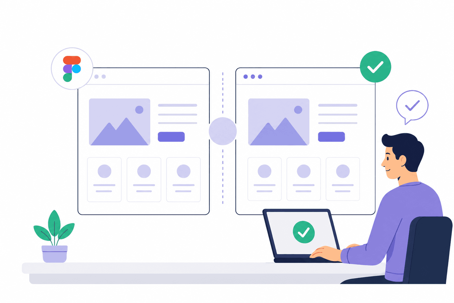
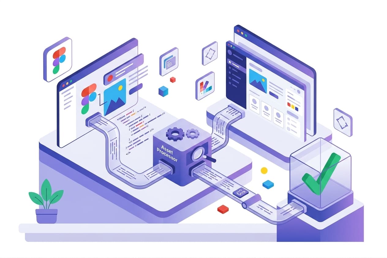
That's exactly what Whoogy is built for. Whoogy compares your Figma design with the actual website, finds visual differences, and gives your team a QA report in less than 3 minutes.
Stop letting clients find bugs you could have caught. Check Your Website Against Figma with Whoogy →
What Is Website QA?
Website QA, or quality assurance, is the process of checking a website before client approval or launch to make sure it works correctly, matches the approved design, works across relevant screen sizes, has accurate content, has functioning links and forms, has no obvious visual defects, and is ready for client review.
For agencies, QA shouldn't depend on whether someone remembers to check the website. It should be a repeatable pre-approval process.
A simple workflow is: Build → QA → Fix → Final Review → Client Approval
Not: Build → Client Finds Issues → Revision → Fix → Client Finds More Issues.
The Problem With Traditional Website QA
Most agencies already perform some type of QA. The problem is that functional QA doesn't necessarily catch visual problems.
A developer might check whether the button works, whether the form submits, whether the navigation opens, whether links work, whether the site loads, and whether it works on mobile. All important questions.
But there's another question: does the website actually match what the client approved in Figma?
A website can pass every functional test and still have wrong spacing, incorrect font weights, different colors, misaligned sections, incorrect button dimensions, different image sizes, missing elements, or mobile layout differences.
These are the issues that become client revisions — and the ones a functional QA checklist alone will never catch.
See exactly where your build drifts from Figma. Run a Free Figma-to-Website Comparison →
Website QA Checklist Before Client Approval
Use this process before sending an approval link.
1. Compare the Website Against Figma
If the website was designed in Figma, start with the approved design. Compare page structure, section order, spacing, typography, colors, buttons, cards, images, icons, borders, border radius, alignment, and components.
Don't just ask "does this look good?" Ask "does this match the approved Figma design?" That's a much more objective QA question.
The problem with doing this manually: for every page, someone has to open Figma, open the website, switch between them, compare the layout, inspect the details, and repeat the process across desktop and mobile. For a five-page website, that's manageable. For a 20-page website across multiple breakpoints, it becomes repetitive and expensive.
This is where Whoogy helps. Whoogy compares the approved Figma design against the actual website so your team can find visual differences without manually checking every detail.
Skip the manual side-by-side. Run a Figma-to-Website Comparison with Whoogy →
2. Check Desktop Layout
Test the primary desktop breakpoint. Look for incorrect container widths, misaligned grids, incorrect section heights, broken columns, incorrect image dimensions, typography differences, spacing inconsistencies, and overflow.
Pay particular attention to the areas clients notice first: Navigation → Hero → Main sections → CTAs → Forms → Footer.
A small footer spacing issue may not matter. A broken hero layout absolutely does.
3. Check Mobile Responsiveness
Desktop QA isn't enough. Open the website at the relevant mobile dimensions and check navigation, the hamburger menu, hero section, buttons, cards, images, forms, typography, section spacing, content stacking, and horizontal scrolling.
If the client supplied a mobile Figma design, compare the implementation against it. A page can look perfect at 1440px and still be completely wrong at 390px.
Use Whoogy for the visual comparison. Instead of relying entirely on memory or manual eyeballing, use Whoogy to compare the mobile implementation against the design: Figma → Mobile Website → Whoogy → Visual Differences → Fix. That makes responsive visual QA part of the actual delivery process.
Catch mobile mismatches before your client scrolls their phone. Try Whoogy on Your Next Mobile Build →
4. Test Navigation and Links
Click through the website. Check header navigation, footer links, CTAs, internal links, external links, the logo, breadcrumbs, and buttons.
A website can look perfect while containing one broken CTA. For an agency, that can mean: client message → developer task → fix → QA → another approval. Catch it before the approval link goes out.
5. Test Every Important Form
Don't just check that the form appears — actually submit it. Check required fields, validation, error messages, success states, email delivery, confirmation messages, redirects, and mobile behavior.
A beautiful lead-generation website with a broken contact form isn't ready for client approval.
6. Check Images and Content
Review headlines, paragraphs, images, logos, icons, links, contact information, pricing, legal text, and alt text. Look for lorem ipsum, placeholder images, dummy phone numbers, temporary links, "coming soon" labels, and incorrect client information.
These are easy for your team to catch and easy for a client to notice.
7. Check Typography
Typography differences are among the most noticeable visual mismatches. Verify font family, font weight, font size, line height, letter spacing, and heading hierarchy.
For Figma-based projects, compare typography directly against the approved design. A wrong font weight can change line wrapping, heading width, section height, visual hierarchy, and overall appearance.
Typography drift is easy to miss and easy to automate. Let Whoogy Check Your Type Against Figma →
8. Test Interactive States
Don't only test the default state. Where relevant, check hover, focus, active, disabled, open, closed, error, success, and loading states.
A button can look perfect in its default state and still have a completely wrong hover state.
9. Check Basic SEO
Before client approval, review page titles, meta descriptions, H1s, heading hierarchy, canonical URLs, indexability, image alt text, Open Graph data, sitemap, and robots.txt.
SEO QA and visual QA are different, but both belong in a professional website pre-launch process.
10. Check Browser Compatibility
Test the browsers required for the project. Pay attention to fonts, animations, layout, forms, navigation, sticky elements, and JavaScript interactions.
Don't try to test every possible browser combination. Define the browsers your agency supports and make that part of the standard QA process.
The Most Important QA Step for Figma-Based Agencies
Traditional website QA answers: "does the website work?"
Figma-to-website QA answers: "does the website match what the client approved?"
You need both. For example: the approved Figma spec shows a button height of 52px. The live website ships it at 44px. The button works. The link works. The form submits. But the implementation doesn't match the design. That's a visual QA failure — and if your team doesn't catch it, the client probably will.
Don't let an 8px difference turn into a revision cycle. Compare Your Build Against Figma in 3 Minutes →
Don't Let the Client Become Your QA Team
Here's a simple rule every agency should follow: client review should validate the finished work, not discover basic defects.
The client shouldn't be finding broken links, missing sections, wrong fonts, incorrect spacing, broken mobile layouts, missing images, incorrect buttons, or obvious Figma mismatches.
Legitimate client feedback will always exist. That's normal. But avoidable implementation mistakes shouldn't become client feedback.
Where Whoogy Fits Into Your QA Process
Your current process might look like this: Figma → Development → Manual QA → Client Approval → Client Finds Visual Issues → Revision → Development Again. That's where agencies lose time.
A better process looks like this: Figma → Development → Whoogy Figma-to-Website Comparison → Visual Differences → Fix → Final QA → Client Approval → Launch.
Whoogy becomes the visual QA layer between development and client approval. You keep your existing functional and technical QA — Whoogy handles the repetitive Figma-to-website visual comparison.
What Whoogy Checks
Whoogy is designed for agencies that build websites from Figma. It helps your team identify differences across:
Layout — does the rendered page match the Figma layout?
Spacing — are margins and padding consistent with the design?
Typography — are font sizes, weights, and text layouts correct?
Colors — do buttons, backgrounds, borders, and text match?
Components — are repeated UI components implemented consistently?
Images — are dimensions and positioning correct?
Responsive UI — does the website match the relevant desktop and mobile designs?
Instead of spending hours looking for differences, your team can focus on fixing them.
Spend your team's time fixing bugs, not hunting for them. See What Whoogy Finds on Your Site →
Why Use Whoogy Before Client Approval?
Because the cost of finding a visual issue changes depending on who finds it.
Developer finds it: fix → QA → done. QA finds it: fix → re-test → done. Client finds it: feedback → project manager → developer → fix → QA → new link → client review.
The third one is the expensive loop. Whoogy is designed to help move visual issue discovery before client review — where it's cheapest to fix.
A Simple Pre-Approval Workflow for Agencies
Here's the process we'd recommend:
Approve the Figma — make sure everyone is working from the same source of truth.
Build the website — development turns the approved design into the actual implementation.
Run Whoogy — compare the Figma design against the website.
Review visual differences — identify what needs to be fixed.
Fix — developers resolve the implementation issues.
Run final QA — check functionality, responsiveness, forms, links, content, and SEO.
Send to the client — now the client receives a build your team has already checked.
Launch — move forward without another avoidable revision loop.
Put Whoogy at step 3 of every project. Start Your Free Figma-to-Website Comparison →
Free Website QA Checklist for Web Agencies
Before sending your next client approval link, run through this:
Design QA: approved Figma version confirmed, correct Figma frame selected, layout matches, spacing matches, typography matches, colors match, buttons match, cards match, images match, components are consistent.
Responsive QA: desktop checked, tablet checked where required, mobile checked, navigation checked, responsive spacing checked, images checked, typography checked, no horizontal overflow.
Functional QA: navigation works, buttons work, forms work, links work, CTAs work, interactive states work.
Content QA: no placeholder content, correct images, correct copy, correct contact information, correct links, alt text checked.
Final Approval: Figma-to-website comparison completed, visual differences fixed, final QA completed, approval link tested, website is client-ready.
Want this checklist as a printable PDF your whole team can use? Get the Free Website QA Checklist → — and run your first Figma comparison while you're there.
Don't Want to Compare Figma and Websites Manually?
That's exactly why we built Whoogy. Instead of opening Figma, opening the website, switching between tabs, zooming in, checking spacing, checking typography, and repeating the process page by page — let Whoogy find the visual differences for you.
Figma → Website → Whoogy → QA Report → Fix → Client
Run your next Figma-to-website QA in less than 3 minutes.
Catch visual issues before your client does.
Try Whoogy Free → No more tab-switching. No more guessing what changed. Just a clear report of every visual difference between your Figma file and your live site — in under 3 minutes.
Frequently Asked Questions
What should I check before sending a website to a client?
Check functionality, responsive behavior, links, forms, content, typography, visual design, SEO basics, browser compatibility, and whether the website matches the approved Figma design.
How do I compare a website to Figma?
You can manually compare the Figma design with the rendered website, or use a Figma-to-website visual QA tool like Whoogy to identify visual differences more efficiently.
What is Figma-to-website QA?
Figma-to-website QA is the process of comparing an approved Figma design against the implemented website to identify visual differences before client approval or launch.
Why should web agencies compare websites with Figma?
Functional testing can confirm that a website works, but it doesn't confirm that the implementation matches the approved design. Figma comparison helps agencies catch visual issues before clients discover them.
How can agencies reduce website revisions?
Create a pre-approval QA process that includes functional testing, responsive testing, and Figma-to-website visual comparison. Fix implementation issues before sending the website to the client. Whoogy automates the comparison step so it's fast enough to run on every project.
What is Whoogy?
Whoogy is a Figma-to-website visual QA tool that helps agencies compare their approved Figma designs with website implementations and identify visual differences before client approval — in under 3 minutes.
Conclusion
A professional web agency shouldn't send a client an approval link and hope everything looks right.
Your process should be: Functional QA + Responsive QA + Design QA + Figma Comparison + Final Review.
The goal isn't zero client feedback. The goal is to eliminate avoidable client feedback.
If your agency builds from Figma, make Figma-to-website visual QA a standard step before every client approval. And if manually comparing Figma with the website is taking hours, Whoogy can handle the repetitive comparison in minutes.
Catch visual issues before your client does.
Compare Your Figma Design With Your Website Using Whoogy →
Less manual checking. Fewer avoidable revisions. Faster client approvals.